The Bold Type: Behind the Fonts We Use and Why They Matter

Fonts are like drag: you can say all the right things, but if the look doesn’t match the vibe, nobody’s tipping.
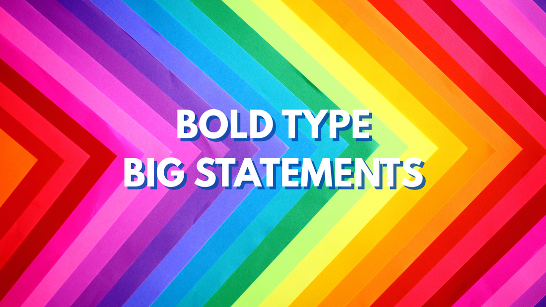
We don’t just pick fonts at Have Fun Spread Joy — we cast them.
Every typeface we use is a character, a mood, a statement. They shout, whisper, sashay, and occasionally stomp their feet. Whether on a t-shirt, a sticker, or a poster that screams from your gallery wall, the type should be just as loud as the message.
Our Ride-or-Die: League Spartan
First, meet our headliner: League Spartan. This font is big and bold and doesn’t apologize for taking up space, which makes it basically our mascot. It’s the backbone of our brand—the font equivalent of a power stance in glitter heels.
With strong lines and geometric confidence, League Spartan is what we use when we want to be heard before you even start reading. It’s clean, modern, and fierce in a “graphic designer with a septum ring and really good taste in playlists” kind of way.
Also? It’s open-source and community-built. Which means it’s free, fabulous, and not part of a billion-dollar monopoly — just like us.
And while it’s not officially connected, we can’t help but smile at the cosmic coincidence: our beloved font shares a name with Michigan State University’s mascot. (Matt's alma mater, Go Green! 💚) League Spartan might not be wearing a foam helmet and shouting from the student section, but it's definitely giving Big Font Energy.
But Wait, There’s More…
Now, don’t get us wrong — Spartan’s our main squeeze, but we believe in polytypography. Our design playground is packed with character fonts that bring drama, whimsy, nostalgia, and a splash of camp.
Some of our go-to flavor fonts include:
- Chunky 70s throwbacks with bell-bottomed flair
- Sassy serifs that look like they just rolled their eyes at your text
- Playful hand-drawn styles that say, “I’m weird and proud.”
- Cursive that serves mid-century charm, like a vintage recipe card with secrets
We use fonts the way drag queens use wigs — to transform, exaggerate, and say something louder.
Why It Matters (No, Really)
You may not consciously think about fonts, but your brain does. Fonts are the first impression, the mood-setter, the spark that lights the fire. Think of them as the soundtrack to the words. A font can make “Yes!” feel like a hug… or a dare… or a wedding proposal shouted from the rooftop.
When we’re designing a tote that says “Entering My Villain Era” or a sticker that reads “Democracy Over De'Billionaires,” we’re not choosing fonts lightly. We want every word to have a vibe, a posture, a strut. Our typefaces carry the soul of our messages — and our souls are a little sparkly, a little spicy, and very, very bold.

In fact, if you’ve ever watched The Bold Type (Matt is a superfan), you know exactly what we mean. It’s not just about having something to say — it’s about saying it fearlessly, fashionably, and with just the right font. Power, voice, and good design? That’s our whole type.
What’s Coming Next
We’re always on the hunt for fonts that feel like friends: the misfits, the divas, the ones that don’t quite fit in on the corporate shelf. As we grow, you’ll see us experiment more — mixing vintage charm with protest posters, comedy with queerness, and clarity with camp.
Because at the end of the day, it’s not just about what you say. It’s how you say it. And around here? We say it LOUD, PROUD, and in fonts that could walk the runway.
Ready to Wear Your Words?
If you’re feelin’ the fonts and vibin’ with the voice, why not wear the boldness? Head over to our shop and snag something that says exactly what you’re thinking — loud, proud, and in fabulous type. Whether it’s a tee that claps back, a sticker that stirs the pot, or wall art that makes a statement before you even speak, we’ve got you covered (literally).
Shop the boldest designs now at havefunspreadjoy.com — because your wardrobe deserves a little sass and a whole lot of typeface.