Color Me Loud: Why Maximalism Is Queer Pride in Full Bloom
For queer folks, color has never just been about style. It has been a signal, a protest, a refuge, and a birthright.
This isn’t just a blog about aesthetics. It’s a Pride story — told in rhinestones and rainbow stripes, in sticker-covered trapper keepers and hot pink buses. It’s about Maximalism as defiance, as celebration, and as truth-telling in a world that often demands we shrink.
From the lavender legacies of protest marches to the glitter-soaked drag stages that raise us, color has always been our language. And when we live out loud—with our walls, our clothes, our words, our joy—we aren’t just decorating the world. We’re changing it.
🎨 A History of Hue: Color as Queer Resistance
We don’t always learn it in school, but queer history is deeply saturated with symbolism, and color has played a starring role.
- In Nazi Germany, the pink triangle was used to label and persecute homosexual men in concentration camps. Estimates suggest 5,000 to 15,000 men were imprisoned this way.
- By the 1970s and 1980s, the pink triangle was reclaimed by ACT UP and other queer activists during the AIDS crisis, transforming it into a symbol of empowerment and resistance.
- Lavender, a color historically associated with femininity and androgyny, became shorthand for queerness, especially among lesbian and gender-nonconforming communities.
And then came the rainbow. 🌈

Gilbert Baker’s 1978 Pride Flag wasn’t just a pretty banner. It was a statement. Originally featuring eight colors (each with its own meaning), the flag condensed over time into the six-stripe version we recognize today. Red for life. Orange for healing. Yellow for sunlight. Green for nature. Blue for serenity. Violet for spirit.
Over the years, the Pride flag has continued to evolve, expanding to better reflect the full spectrum of the LGBTQ+ community. Designs like the Progress Pride Flag and others have added black and brown stripes to represent people of color, and pink, light blue, and white to represent trans and nonbinary identities — affirming that our diversity is our strength, and visibility is ongoing work.
Color, for queer people, has never been frivolous. It has always been strategic, expressive, and sacred.
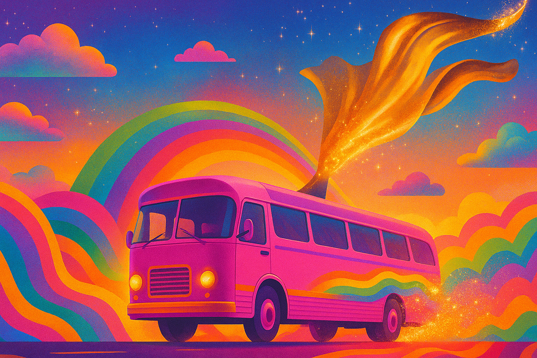
🚌 Priscilla and the Power of Pink
Take Priscilla, Queen of the Desert, a 1994 cult classic that is as much a visual feast as it is a queer odyssey. Three drag queens drive a run-down bus across the Australian outback, encountering bigotry, beauty, and the bonds of chosen family along the way.
But the real magic? They paint the bus bright pink.
It is an act of visibility in a hostile landscape, a choice to turn something ordinary into a monument of joy and defiance.
In the Broadway adaptation, this scene is underscored by Petula Clark’s “Color My World,” anchoring the symbolism with a literal anthem. It is more than camp. It is transformation—a queer creative act that says, “We refuse to be hidden.”
✨ Fiction as Mirror: Color in Queer Pop Culture
Queer-coded stories have always used color as metaphor. Consider:
- The vibrant wigs and split-screen dreamscapes of To Wong Foo, Thanks for Everything! Julie Newmar.
- The bubblegum punk glam of Hedwig and the Angry Inch.
- The bold, gender-bending costumes of Xanadu, Velvet Goldmine, and Paris is Burning.
Camp aesthetics, often misunderstood or dismissed, are deliberate artistic choices. In her 1964 essay Notes on Camp, Susan Sontag wrote that this style “converts the serious into the frivolous.” It is a way of queering the mainstream through excess, parody, and, yes, color.

📊 Data That Supports the Power of Queer Aesthetics
- According to a 2021 YouGov poll, LGBTQ+ Americans are significantly more likely to describe their personal style as “expressive” or “colorful” compared to the general population.
- A 2023 report by Adobe Creative Insights noted that Gen Z and LGBTQ+ creators are leading the return of maximalist color in digital art, citing color as a “form of identity declaration.”
- Pride merchandise sales (everything from rainbow apparel to home décor) generate over $1 billion annually in the U.S., demonstrating both the popularity and economic power of queer-coded design.
These are not just trends. They are cultural affirmations.
💖 Living Colorfully Is Not a Trend. It Is a Survival Tactic.
Maximalism, for many queer people, is not excess. It is existence.
We reclaim the right to delight in ourselves when we dress loudly, decorate proudly, or build businesses dripping in whimsy and weirdness. Color becomes a tool for healing, for celebration, for protest.
That is why, at Have Fun, Spread Joy, color is not an afterthought. It is our identity, our act of rebellion, and our love language.
🎨 Live Loud. Love Bright. Color Everything.
This Pride — and every season after — we embrace the truth that Maximalism is more than a style. It’s a form of resistance, a source of healing, and a celebration of who we are in full technicolor.
We wear the shimmer, fly the flag, paint the walls, and blast the playlist, not just for fun (though it is). We do it because queer joy is a radical act. Because too often, we’ve been told to quiet down, tone it down, fade into the background.
Not anymore.
So go ahead — wear the sequins. Drape your world in rainbows. Paint your bus pink. Whether you’re on a stage, in a crowd, or at your kitchen table crafting magic, remember this:
Be loud.
Be luminous.
Be too much.
Paint your bus pink.
📚 Sources and Suggested Reading
- United States Holocaust Memorial Museum – Persecution of Homosexuals
- ACT UP Oral History Project – Pink Triangle
- “The Lavender Scare” – PBS Documentary
- Gilbert Baker’s Pride Flag – GLBT Historical Society
- Susan Sontag, Notes on “Camp”, 1964
- YouGov: LGBTQ+ Attitudes Toward Style and Identity (2021)
- Adobe Creative Insights: Color Trends and Maximalism (2023)
- Statista: Pride Merchandise Market Data (2023)